Keep each language in its natural order, separate roles by line or size, and check punctuation at the final canvas size.حافظ على الترتيب الطبيعي لكل لغة، وافصل الأدوار بالسطر أو الحجم، وراجع الترقيم بالمقاس النهائي.
Let the browser handle character orderاترك ترتيب الحروف للمتصفح
Write Arabic and English in their natural order. Never reverse Arabic letters manually; the editor uses right-to-left direction and the browser’s text-shaping engine.اكتب العربية والإنجليزية بترتيبهما الطبيعي. لا تعكس الأحرف العربية يدوياً؛ المحرّر يستخدم اتجاه الكتابة من اليمين إلى اليسار ومحرك النص في المتصفح.
Test punctuation and numbersاختبر علامات الترقيم والأرقام
Brackets, dashes, and numbers may shift visually at language boundaries. Review the complete line and, if it looks crowded, split it into two lines instead of inserting extra spaces.الأقواس والشرطات والأرقام قد تنتقل بصرياً عند حدود اللغتين. عاين السطر كاملاً، وإذا بدا مزدحماً فقسّمه إلى سطرين بدلاً من إضافة مسافات كثيرة.
- Choose a font with compatible Latin characters when the text is mixed.اختر خطاً يحتوي على حروف لاتينية متناسقة إن كان النص مختلطاً.
- Avoid artificial letter spacing because it can break Arabic connections.تجنّب تباعد الحروف الاصطناعي لأنه قد يقطع اتصال العربية.
- Preview the design at its final size, not only in the editor.عاين التصميم في المقاس النهائي، لا في شاشة التحرير فقط.
Separate roles instead of forcing one lineافصل الأدوار بدلاً من إجبارها على سطر واحد
When a design contains an Arabic name, an English translation, and a date, give each element a clear visual role. Put the primary phrase on one line, the translation or description on a smaller line, and the date in its own position.عندما يحتوي التصميم على اسم عربي وترجمة إنجليزية وتاريخ، اجعل لكل عنصر وظيفة بصرية واضحة. ضع العبارة الأساسية في سطر، والترجمة أو الوصف في سطر أصغر، والتاريخ في موضع مستقل.
This reduces direction problems and gives you more control over alignment. It also lets you resize the English without affecting Arabic letter connections.هذا الأسلوب يقلل ارتباك الاتجاه ويمنحك تحكماً أفضل في المحاذاة. كما يسمح بتغيير حجم الإنجليزية من دون التأثير في اتصال الحروف العربية.
Choose a font that balances both scriptsاختر خطاً يدعم اللغتين بصرياً
The presence of Latin characters in a font file does not guarantee that Arabic and English will feel balanced together. Compare letter height, stroke weight, and the visual space between lines.وجود أحرف لاتينية داخل ملف الخط لا يعني بالضرورة أن العربية والإنجليزية تبدوان متوازنتين معاً. قارن ارتفاع الحروف وسماكة الخط والمسافة البصرية بين السطرين.
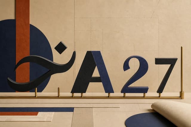
If the English looks too large, reduce it slightly instead of compressing the Arabic. Test both Arabic-Indic digits ١٢٣ and Western digits 123 because their width and rhythm vary by typeface.إذا كانت الإنجليزية تبدو أكبر، خفّض حجمها قليلاً بدلاً من ضغط العربية. واختبر الأرقام العربية ١٢٣ والأرقام الغربية 123 لأن عرضها وإيقاعها يختلفان بين الخطوط.
- Use comparable visual weights for both scripts.استخدم وزناً متقارباً بين اللغتين.
- Keep one clear alignment for the complete block.حافظ على محاذاة واحدة واضحة للكتلة كاملة.
- Avoid leaving a punctuation mark alone at the edge of a mixed line.تجنّب وضع علامة ترقيم منفردة عند طرف السطر المختلط.
Keep the hierarchy clearحافظ على وضوح التسلسل
Place the main name or phrase on its own line, then add the translation or number at a smaller size. This reduces direction issues and makes the design faster to read.ضع الاسم أو العبارة الأساسية في سطر مستقل، ثم أضف الترجمة أو الرقم بحجم أصغر. هذا يقلل مشكلات الاتجاه ويجعل التصميم أسرع قراءة.
Before exporting, read the design from right to left and then as one visual block. Check the order of digits, brackets, and dashes, then open the final PNG to confirm that it matches the preview.قبل التصدير، اقرأ التصميم مرة من اليمين إلى اليسار ومرة ككتلة بصرية كاملة. افحص ترتيب الأرقام والأقواس والشرطة، ثم افتح PNG النهائي للتأكد من مطابقته للمعاينة.