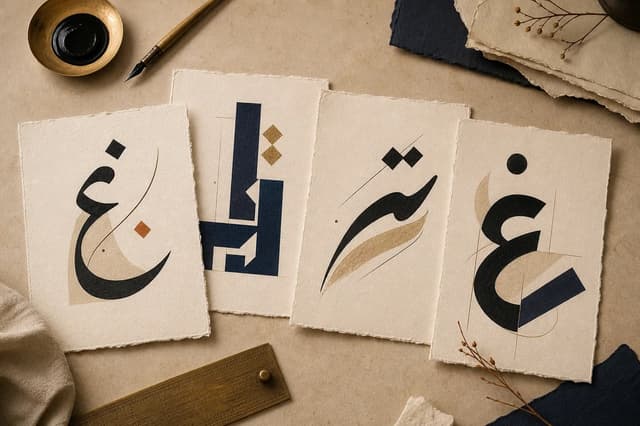
Choose for the job first: Naskh for reading, Kufi for structure, and softer display styles for names.اختر حسب الوظيفة أولاً: النسخ للقراءة، والكوفي للبناء الهندسي، والخطوط اللينة للأسماء.
Worked examples you can downloadأمثلة تطبيقية قابلة للتنزيل
These files were generated by Arabic Type Studio and checked in Chrome 153 on Windows on October 6, 2026. We checked PNG dimensions, transparent corners, and space around the lettering. External design-app imports are not part of this check.أُنشئت الملفات باستخدام Arabic Type Studio وفُحصت في Chrome 153 على Windows في 6 أكتوبر 2026. شمل الفحص أبعاد PNG وشفافية الزوايا والمساحة حول الحروف. لم يشمل الاستيراد في تطبيقات التصميم الخارجية.
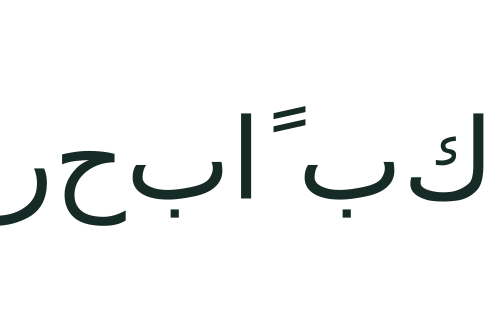
A transparent Arabic headingعنوان عربي شفاف
مرحباً بكم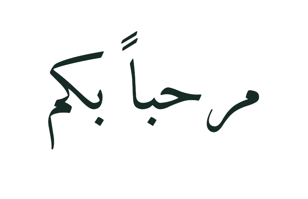
- Font / weight / sizeالخط / الوزن / الحجم
- Amiri · 400 · 112 px
- Padding / line spacingالهامش / تباعد الأسطر
- 64 px · 1.45
- Color / backgroundاللون / الخلفية
- #172b26 · Transparentشفافة
- Direction / alignmentالاتجاه / المحاذاة
- Auto / centerتلقائي / وسط
- Harakatالحركات
- Keepإبقاء
- PNG at 2×PNG بدقة 2×
- 988 × 640 px
Content-sized canvas; no shadow or outline. In the PNG maker, enter the text above, choose this font, then open Size, spacing & text direction to match these settings.لوحة بحسب حجم المحتوى؛ دون ظل أو حد خارجي. أدخل النص أعلاه في أداة PNG واختر الخط، ثم افتح الحجم والمسافات واتجاه النص لمطابقة الإعدادات.
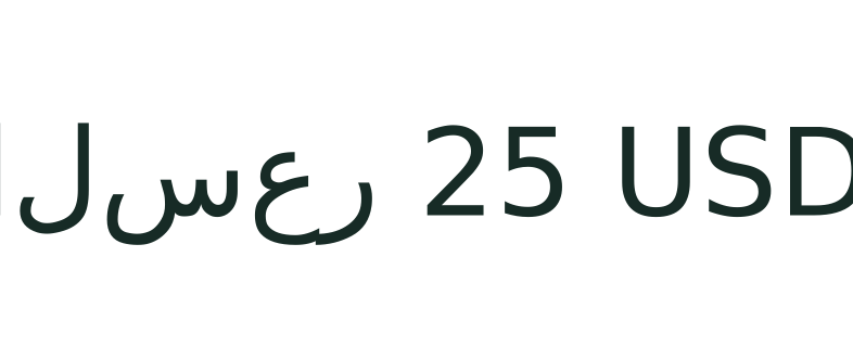
Arabic first, Latin priceالعربية أولاً مع سعر لاتيني
السعر 25 USD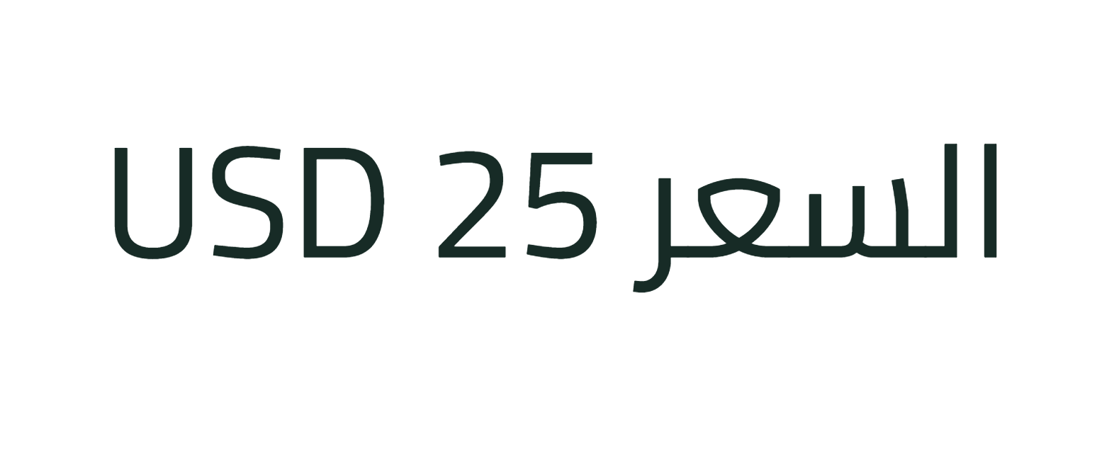
- Font / weight / sizeالخط / الوزن / الحجم
- Cairo · 400 · 112 px
- Padding / line spacingالهامش / تباعد الأسطر
- 64 px · 1.45
- Color / backgroundاللون / الخلفية
- #172b26 · Transparentشفافة
- Direction / alignmentالاتجاه / المحاذاة
- Auto / centerتلقائي / وسط
- Harakatالحركات
- Keepإبقاء
- PNG at 2×PNG بدقة 2×
- 1572 × 640 px
Content-sized canvas; no shadow or outline. In the PNG maker, enter the text above, choose this font, then open Size, spacing & text direction to match these settings.لوحة بحسب حجم المحتوى؛ دون ظل أو حد خارجي. أدخل النص أعلاه في أداة PNG واختر الخط، ثم افتح الحجم والمسافات واتجاه النص لمطابقة الإعدادات.
What to check in your resultما الذي تفحصه في النتيجة؟
- In the library, choose Vowel marks, then compare Regular 400 and Bold 700. Look at the small spaces between dots and marks, not only the silhouette of the word.اختر عينة الحركات في المكتبة، ثم قارن العادي 400 بالعريض 700. راقب المسافات الصغيرة بين النقاط والحركات، لا هيئة الكلمة وحدها.
- Then replace the sample with your complete heading. These two downloads use different phrases, so they demonstrate exports, not a controlled comparison of font width. Use the same phrase in the library for a fair comparison.ثم استبدل العينة بعنوانك كاملاً. يستخدم التنزيلان عبارتين مختلفتين، لذا يعرضان التصدير ولا يقارنان عرض الخطوط مقارنة مضبوطة. استخدم العبارة نفسها في المكتبة للمقارنة العادلة.
Start with the text’s purposeابدأ بوظيفة النص
The most beautiful font is not always the right one. First ask whether the text must be read quickly on a phone, appear as a large heading, or be printed on a card.الخط الجميل ليس دائماً الخط الأنسب. اسأل أولاً: هل سيُقرأ النص بسرعة على هاتف، أم سيظهر عنواناً كبيراً، أم سيُطبع على بطاقة؟
The smaller the size or the longer the text, the more important clear letterforms and generous internal spacing become.كلما صغر المقاس أو طال النص، زادت أهمية الوضوح واتساع المسافات الداخلية للحروف.
- Use clear Naskh fonts for longer text and smaller sizes.استخدم خطوط النسخ الواضحة للنصوص الطويلة والمقاسات الصغيرة.
- Try Kufi fonts for headings, logos, and geometric designs.جرّب الخطوط الكوفية للعناوين والشعارات والتصاميم الهندسية.
- Choose Ruqaa or softer styles for names and personal cards.اختر الرقعة أو الخطوط اللينة للأسماء والبطاقات الشخصية.
Test your real textاختبر النص الحقيقي
Do not judge a font from a single sample word. Enter your final phrase and test diacritics, dots, long words, numbers, and punctuation.لا تحكم على الخط من كلمة تجريبية واحدة. اكتب العبارة النهائية واختبر الحركات والنقاط والكلمات الطويلة والأرقام وعلامات الترقيم.
Watch ascenders and descenders so they do not touch the image edges. Leave extra room when using a shadow or outline.راقب الحروف الصاعدة والنازلة حتى لا تقترب من حواف الصورة، واترك هامشاً إضافياً عند استخدام الظل أو الحد الخارجي.
Match the style to where it will be usedطابق أسلوب الخط مع مكان الاستخدام
Naskh is a dependable starting point when fast reading matters more than display, such as explanations and longer quotes. Kufi gives headings and text logos a clearer structure and more geometric presence.خط النسخ خيار آمن عندما تكون القراءة السريعة أهم من الاستعراض، مثل الشروحات والاقتباسات الطويلة. أمّا الكوفي فيمنح العناوين والشعارات النصية بنية أوضح وشكلاً هندسياً.
Handwritten or decorative styles often work best for a single word or short name, but can lose clarity in long sentences or at small sizes.الخطوط ذات الطابع اليدوي أو الزخرفي تنجح غالباً مع كلمة أو اسم قصير، لكنها قد تفقد وضوحها في الجمل الطويلة أو المقاسات الصغيرة.
- For a small post, begin with a clear face and a bold weight.لمنشور صغير: ابدأ بخط واضح ووزن عريض.
- For a name or card, try Ruqaa or a softer style with more breathing room.لاسم أو بطاقة: جرّب الرقعة أو خطاً ليناً مع مساحة تنفّس أكبر.
- For a text logo, compare a modern Kufi with a heavy display face.لشعار نصي: قارن الكوفي الحديث مع خط عرضي ثقيل.
Review the design at its final sizeراجع التصميم بالمقاس النهائي
A design that looks comfortable in a large editor may feel crowded on a phone. Choose the final canvas, then reduce the browser preview or open the exported PNG at the size people will actually see.التصميم الذي يبدو جيداً داخل محرّر كبير قد يصبح مزدحماً على الهاتف. اختر مقاس اللوحة النهائي، ثم قلّل معاينة المتصفح أو افتح ملف PNG الناتج بالحجم الذي سيظهر به فعلاً.
Compare only two or three versions at a time and change one variable, such as the font or weight. This makes it clear what improved the result instead of changing everything together.قارن نسختين أو ثلاثاً فقط في كل مرة، وغيّر متغيراً واحداً مثل الخط أو الوزن. بهذه الطريقة تعرف ما الذي حسّن النتيجة بدلاً من تغيير كل شيء معاً.
Check the license and sourceراجع الترخيص والمصدر
The fonts on this site permit commercial use under their open licenses. If you want to redistribute a font file itself, review its full license and official source first.تسمح الخطوط الموجودة في هذا الموقع باستخدامها تجارياً وفق رخصها المفتوحة. إذا أردت إعادة توزيع ملف الخط نفسه، فراجع نص الترخيص الكامل ومصدره الرسمي أولاً.
Creating an image or logo with a font is different from selling or redistributing the font software. Keep the source link and license copy when the design is part of an important commercial project.إنشاء صورة أو شعار باستخدام الخط يختلف عن بيع ملف الخط أو إعادة توزيعه. احتفظ برابط المصدر ونسخة الترخيص عندما يدخل التصميم في مشروع تجاري مهم.