Use a transparent background, leave room for diacritics and effects, then export at the pixel size your final project needs.استخدم خلفية شفافة واترك مساحة للحركات والتأثيرات، ثم صدّر بالحجم المناسب لمشروعك النهائي.
Create a transparent imageأنشئ صورة بخلفية شفافة
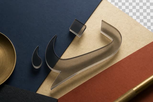
The homepage and Arabic Text to PNG tool always export a transparent background. Type your words, select a font and color, then choose Download PNG. The checkerboard and dark-preview option are only viewing aids; neither becomes part of your image.تصدّر أداة الصفحة الرئيسية وأداة النص العربي إلى PNG خلفية شفافة دائماً. اكتب كلماتك واختر الخط واللون ثم اضغط تنزيل PNG. المربعات وخيار المعاينة الداكنة وسائل للعرض فقط، ولا يظهر أي منهما في الصورة المنزّلة.
Use editable text when your app supports itاستخدم النص القابل للتحرير عندما يدعمه تطبيقك
If you need frequent wording changes, animated letters, or subtitles across an entire video, first try your editor’s Arabic or right-to-left text settings with an Arabic font. Disconnected letters can also come from letter spacing; try the default spacing before rebuilding the design.إذا كنت تحتاج إلى تعديل الكلمات باستمرار أو تحريك الحروف أو إضافة ترجمة نصية لفيديو كامل، فجرّب أولاً إعدادات العربية أو الاتجاه من اليمين إلى اليسار في محرّرك مع خط عربي. قد يتسبب تباعد الحروف في فصلها؛ جرّب التباعد الافتراضي قبل إعادة التصميم.
A PNG is useful for a short, fixed title or label when you want to preserve its appearance. It does not translate text, repair a subtitle track, or animate individual letters. The font library offers installable font files if you prefer to keep text editable in another app.تفيد صورة PNG لعنوان قصير وثابت تريد الحفاظ على مظهره. لا تترجم النص ولا تصلح مسار الترجمة ولا تحرّك الحروف منفردة. توفّر مكتبة الخطوط ملفات قابلة للتثبيت إذا أردت إبقاء النص قابلاً للتحرير في تطبيق آخر.
Place your PNG over a video or slideضع PNG فوق فيديو أو داخل عرض
Download the PNG to your device. In your video editor, import it as media and place it on an image or overlay track above the footage. Resize it without stretching, set its duration, and check the final exported video. In a slide editor, use Insert image and choose the downloaded file.نزّل PNG على جهازك. في محرّر الفيديو استورد الملف كوسائط وضعه على مسار صور فوق المقطع. غيّر حجمه دون تمديده واضبط مدته وتحقّق من الفيديو النهائي. في محرّر العروض اختر إدراج صورة ثم الملف المنزّل.
For white lettering, switch to the dark preview while working here. This does not add a dark background to the download. To change the wording or color later, return to this tool and export again; the imported PNG is an image, not a text box.للنص الأبيض استخدم المعاينة الداكنة هنا؛ لن تضيف خلفية داكنة إلى الملف. لتغيير الكلمات أو اللون لاحقاً، عُد إلى الأداة وصدّر من جديد؛ ملف PNG المستورد صورة وليس مربع نص.
Protect diacritics and shadows from clippingاحمِ الحركات والظل من القص
Leave enough padding around the text, especially when using diacritics or a tall typeface. Stronger shadow blur and offset require more space.أضف هامشاً داخلياً كافياً حول النص، خصوصاً عند استعمال الحركات أو خط ذي ارتفاع كبير. كلما زاد تمويه الظل أو إزاحته، احتجت إلى مساحة أكبر.
- Use 2× resolution for posts and presentations.استخدم دقة 2× للمنشورات والعروض.
- Use 3× for video or when the image will be reduced later.استخدم 3× للفيديو أو عندما ستُصغّر الصورة لاحقاً.
- Choose a color that remains clear over the background on which the image will be placed.اختر لوناً يظل واضحاً فوق الخلفية التي ستضع الصورة عليها.
Understand 1×, 2×, and 3× resolutionافهم دقة 1× و2× و3×
The resolution multiplier changes the PNG pixel dimensions, not its aspect ratio. A 1080 × 1080 square becomes 2160 × 2160 at 2× and 3240 × 3240 at 3×.مضاعف الدقة يغيّر عدد البكسلات في ملف PNG ولا يغيّر نسبة العرض إلى الارتفاع. لوحة مربعة 1080 × 1080 تصبح 2160 × 2160 عند اختيار 2×، و3240 × 3240 عند اختيار 3×.
Choose 1× when the file will be used at its original size, 2× as a balanced choice for most screens, and 3× when you will crop it or reduce it inside a video. These options do not affect SVG because it is vector-based.اختر 1× عندما تعرف أن الملف سيُستخدم بالحجم نفسه، و2× كخيار متوازن لمعظم الشاشات، و3× عندما ستقص الصورة أو تصغّرها داخل فيديو. لا تؤثر هذه الخيارات في SVG لأنه متجهي.
Choose color over the real backgroundاختر اللون على الخلفية الحقيقية
Transparent text has no background of its own to protect contrast. Test it over the actual photo or video, especially when that background contains light and dark areas.النص الشفاف لا يملك خلفية تحمي تباينه. اختبره فوق الصورة أو الفيديو الفعلي، خصوصاً إذا كانت الخلفية تحتوي مناطق فاتحة وداكنة في الوقت نفسه.
If contrast cannot be guaranteed, use a restrained outline or controlled shadow instead of a large blurry shadow. The goal is to separate the letters without losing the character of the typeface.إذا تعذّر ضمان التباين، استخدم حدّاً رفيعاً أو ظلاً مضبوطاً بدلاً من ظل كبير ضبابي. الهدف هو فصل الحروف عن الخلفية من دون فقدان شكل الخط.
Check the file where it will be usedتحقق من الملف في مكان استخدامه
Preview the PNG over its actual background before publishing. Some apps add a white background when images are sent, so keep the original file on your device.افتح PNG فوق الخلفية الفعلية قبل النشر. بعض التطبيقات تضيف خلفية بيضاء عند إرسال الصور، لذلك احتفظ بالنسخة الأصلية على جهازك.
If a messaging app displays white behind the design, import the downloaded file directly into your design or video app instead of copying it from a preview. The original browser download keeps its transparency.إذا ظهرت خلفية بيضاء داخل تطبيق مراسلة، جرّب إدراج الملف مباشرة في تطبيق التصميم أو الفيديو بدلاً من نسخه من المعاينة. الملف الأصلي الذي ينزّله المتصفح يحتفظ بالشفافية.